# A tibble: 0 × 26
# ℹ 26 variables: bird_observation_id <dbl>, record_id <dbl>,
#   species_common_name <chr>, species_scientific_name <chr>,
#   species_abbreviation <chr>, age <chr>, wan_plumage_phase <chr>,
#   plumage_phase <chr>, sex <lgl>, count <dbl>, n_feeding <dbl>,
#   feeding <lgl>, n_sitting_on_water <dbl>, sitting_on_water <lgl>,
#   n_sitting_on_ice <dbl>, sitting_on_ice <lgl>, sitting_on_ship <lgl>,
# in_hand <lgl>, n_flying_past <dbl>, flying_past <lgl>, …I’m back doing some #TidyTuesday visualizations. This week let’s get bird-brained. The dataset has 2 objects (I have already joined the wind and sea data to the ships data):
birdsObservation data related to bird sightings. Includes things like bird count, plumage of birds, behavior of birds.shipsObservation data related to the location of the ship, date and time of observation, weather conditions, and sea conditions.
Snapshot of birds data
This dataset is full of missing data. Indeed if I were to drop any row that doesn’t have an value in every column, that analysis would be quite boring:
Let’s look at what the worst offenders are:
          observation    naFrac
1                 sex 1.0000000
2       plumage_phase 0.9983476
3            moulting 0.9976948
4   wan_plumage_phase 0.8046676
5                 age 0.7922846
6           n_feeding 0.5395459
7  n_sitting_on_water 0.5395459
8    n_sitting_on_ice 0.5395459
9       n_flying_past 0.5395459
10     n_accompanying 0.5395459
11   n_following_ship 0.5395459
12  naturally_feeding 0.4318734
13            in_hand 0.4311185
14       accompanying 0.4311185
15    sitting_on_ship 0.4310981
16     following_ship 0.4310981
17     sitting_on_ice 0.4310777
18        flying_past 0.4310165
19   sitting_on_water 0.4308941
20            feeding 0.4303433
That’s essentially everything, except the count.
              observation     naFrac
1                   count 0.05506028
2 species_scientific_name 0.02246068
3     species_common_name 0.01409657
4    species_abbreviation 0.01409657
5     bird_observation_id 0.00000000
6               record_id 0.00000000
Summary of ship data
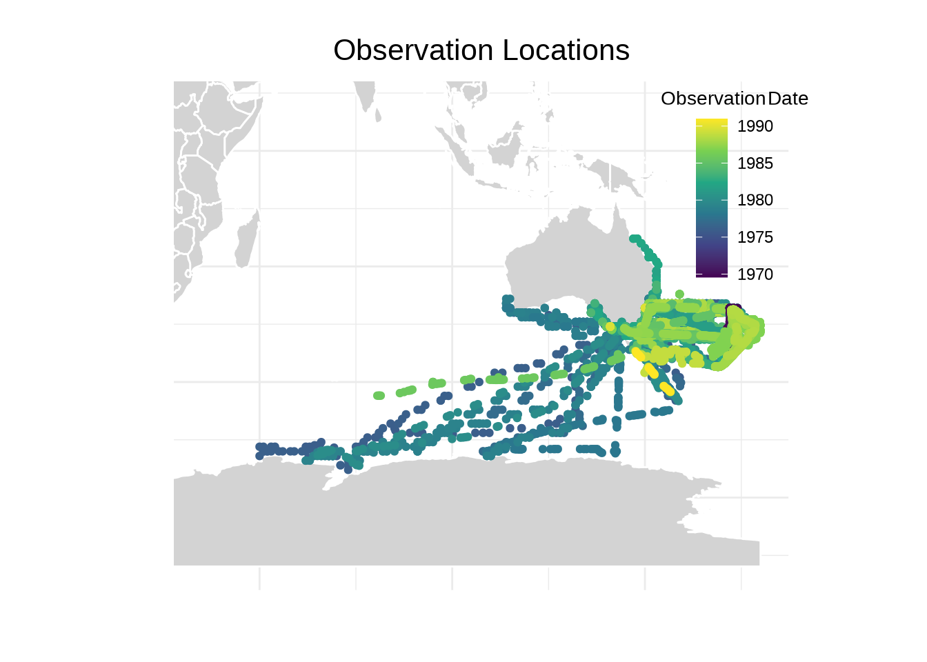
I will begin by getting a sense of when and where this data is being taken.
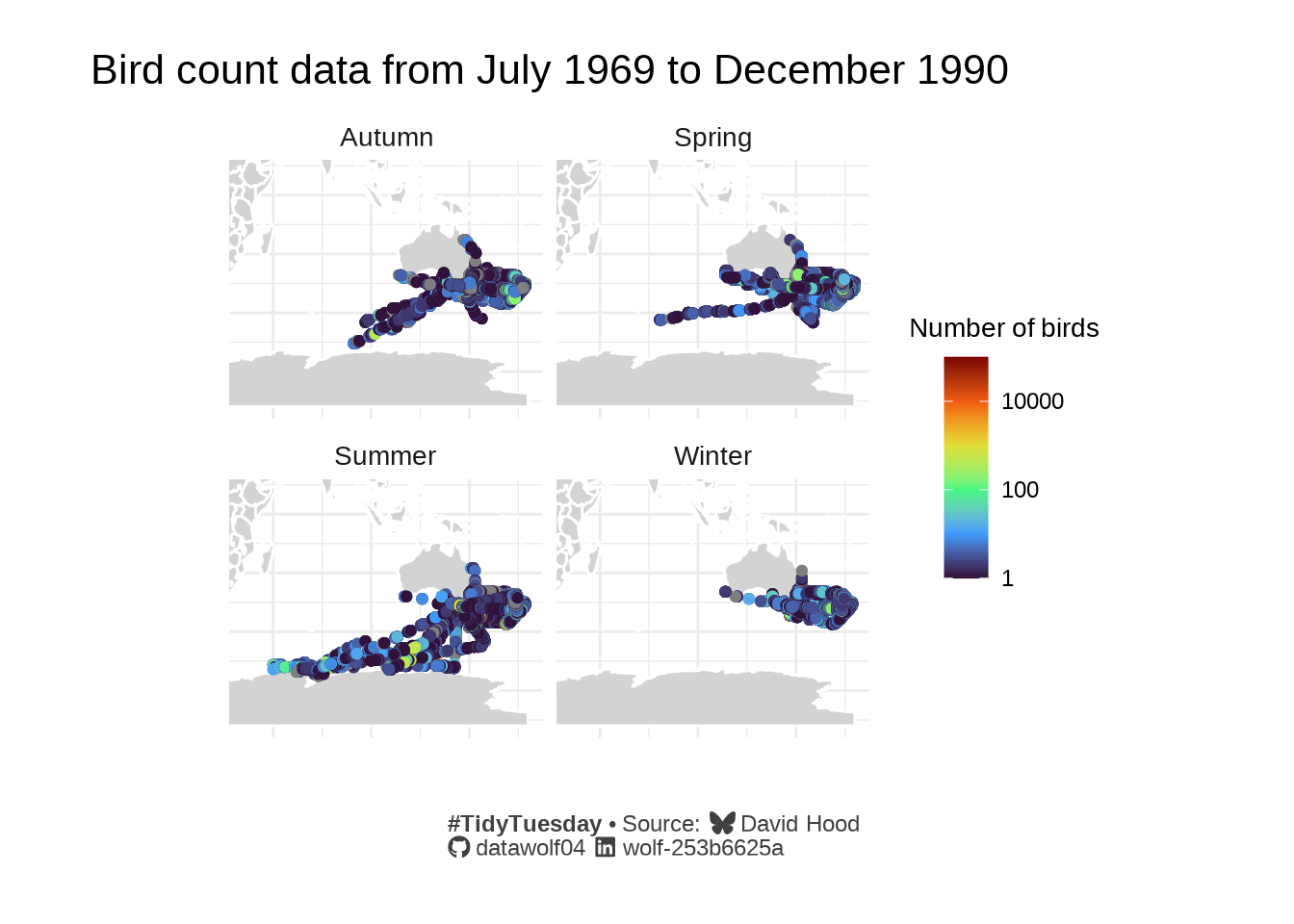
Seasonal patterns in bird observations
Since I’ve been playing with the map functions, I decided to plot count data on the map for different seasons in the dataset.